
It Started With Trim Sheets.
For over six months now, I’ve been consumed with a side project.
(Ok actually it’s been two years and many, many side projects.)
I watched this GDC talk by the awesome devs over at Neon Giant, and was blown away by the depth and sheer cleverness of the systems they’ve designed to create The Ascent.

"The Ascent" by Neon Giant, from the Steam store page
Trim sheets were something I’ve been learning more about over the last year or so, and while they’re old news to industry folks, this is something that was barely discussed during my university course and my Level 3 students have very little time to learn about advanced techniques and UV trickery.
My initial tests were… crude. I understood the principles but learning to essentially design props backwards took some getting my head around. For years I’ve had a concept, modelled it, unwrapped it and textured it - now I basically had to reverse that process, start with the textures (sort of).
A quick little experiment with a custom trim sheet, just learning the ropes.
After this I tried to create storefronts, basic city building designs and some carved stonework. They were all thoroughly ‘meh’.
Tangent time. And guess what - this happens a lot from here out…
A texture atlas is a similar bedfellow to the trim sheet - multiple assets can use the same texture to do different things with. Here’s one of my favourite examples from the old Infinity Blade Grasslands asset pack.

This one mesh was the start for me. I remember looking at the UVs and being utterly confused. Why would they so willingly waste so much UV space? Why is the unwrap so messy? Why does the texture have all the unused stuff on it?
Of course the answer is “Because they know more than you dumbass”. There are dozens of meshes in that content pack that all use the same texture set - because as an early attempt at a graphically impressive mobile game, Infinity Blade had to be as efficient as possible.
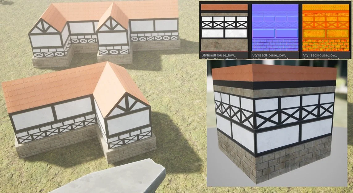
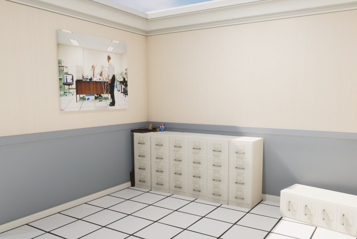
Some months pass, and I created my first asset pack to sell on Epic’s Fab store.
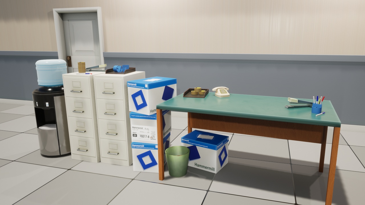
1990's Style Office Props
Sure, there are things I’d do differently, but I set myself a little challenge and got it done from concept to end product and I’m proud of that. No, it did not sell well. The point was to get a store presence of some kind, and to practice, practice, practice.
I learned how to bake and texture multiple assets at the same time, setting up Substance Painter so that each model was baked seperately from the other assets even though they all shared the same origin. There’s probably an easier way of doing that, but I couldn’t get my high poly bakes to work properly when I spaced everything out, so this was the workaround. Five packaged, 2k texture sets for 21 meshes isn’t too bad.
Then there’s the walls. Learning how to create seamless textures involved some trickery with the baking process to avoid getting curvature on the edges of the mesh (expanding the high poly mesh beyond the boundries of the low poly). More learning, more understanding.
Of course here I got very sidetracked learning more about vertex painting, decals and other grunge/dirt techniques. De-mystifying the lerp node.
The point is, I’d still not created an evironment I was particularly invested in and I still hadn’t tried half the techniques from that GDC talk.
One of my biggest weaknesses is that I don’t often properly plan out my work. Part of that is simply not knowing how to plan out my work, I don’t know all the skills and techniques so I learn as I go and things change along the way… but that means I end up with dozens of half finished tests and nothing I’m proud of. At this point my Artstation profile is an embarassment.
My students have this amazing teacher who gets them to construct a little isometric bedroom scene as their first little project in 3d. The project is inspired by the game “Unpacking”.

"Unpacking" by Witch Beam
The difference is the students use simple, low poly 3d models instead of pixel art. It’s a brilliant little project that can be created in a short timeframe with limited knowledge and results in some gorgeous renders every year. It’s great. So I just did it too, but using it as a chance to practice more texture atlasing and play around with the visuals. I needed to finish something “Just for me”.

Again, I only used a handful (6) of texture sets and some very low poly models. I use the scene as an example of how file sizes explode when you have lots of materials using large textures, for example the difference between 1k, 2k and 4k texture sets.
The thing is, it’s not what I want to make. I want to make a sci-fi scene, and I want to do it like Neon Giant did. I want to use a single texture set for everything. I want to see just how efficient I can make a scene. FORESHADOWING.
So why not just… do it like Neon Giant did. Like, exactly. I don’t know how to plan a sci-fi trim sheet so… why not try to copy theirs and see what I learn along the way? It took a few hours:

My mesh designed to replicate the Normal map shown off by Neon Giant
I spent some time messing around with weighted normals. I thought I had the hang of it (silly fool) and cracked on modelling. I learned about floaters only after I’d already wasted a lot of time modelling the details watertight. But I finished it… and baked it. The end result:

It’s got some rough parts. It’s got some absolute guesswork. But if they built a game using something similar, surely I can create a small scene, right?

My first attempt using the newly baked trim sheet.
It was all so very fun. I did everything (probably) wrong and learned along the way. I just loved every second. I took inspiration from some of the amazing art tests done for Star Citizen, and forced myself to learn how to do a few basic renders in Blender.
Now I was in familiar territory, hard surface modelling and then applying what I’d learned about unwrapping for trim sheets, just time to make pipes, pannels, walls, floors and anything else that I thought would be useful (Still no plan, I wonder if that’ll come back to bite me).

Jan '26. I made a lot of variations of this.
Things were coming along nicely, I had a scene in engine and assets that I was happy with, the end result looked exactly like I pictured it in my mind and I was just ecstatic.

Particle effects and lights, rendered in UE 5.2
But all was not well. I was absolutely certain that I wanted to keep the spotlights pointing down on the walls, and little floor striplights pointing up. This was creating extreme levels of lighting complexity.

Debugging view of the scene lighting complexity
So I decided to ditch the UE5 lumen lighting system, and fall back on baked lighting.
The only problem with that plan is, I was initially taught how to use UE4, which was already set up for this pipeline and I was using UE5. It’s really not set up for doing that - and so I had to do more learning.
Everything set up, lets try again:

Oh dear.
The good news is: It’s running really fast.
The bad news is everything else. Why does it look like that, how do I fix it? I’ll get into that next time.
Spoiler alert: Lightmaps.